Booklet front and back cover
Booklet front cover
Booklet page 2-3
Booklet page 4-5
Booklet page 6-7
About the project
The objective of this RMIT project was to produce a booklet featuring a graphic designer, artist or style and integrate this work into the booklet.
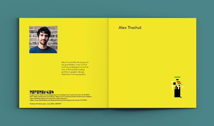
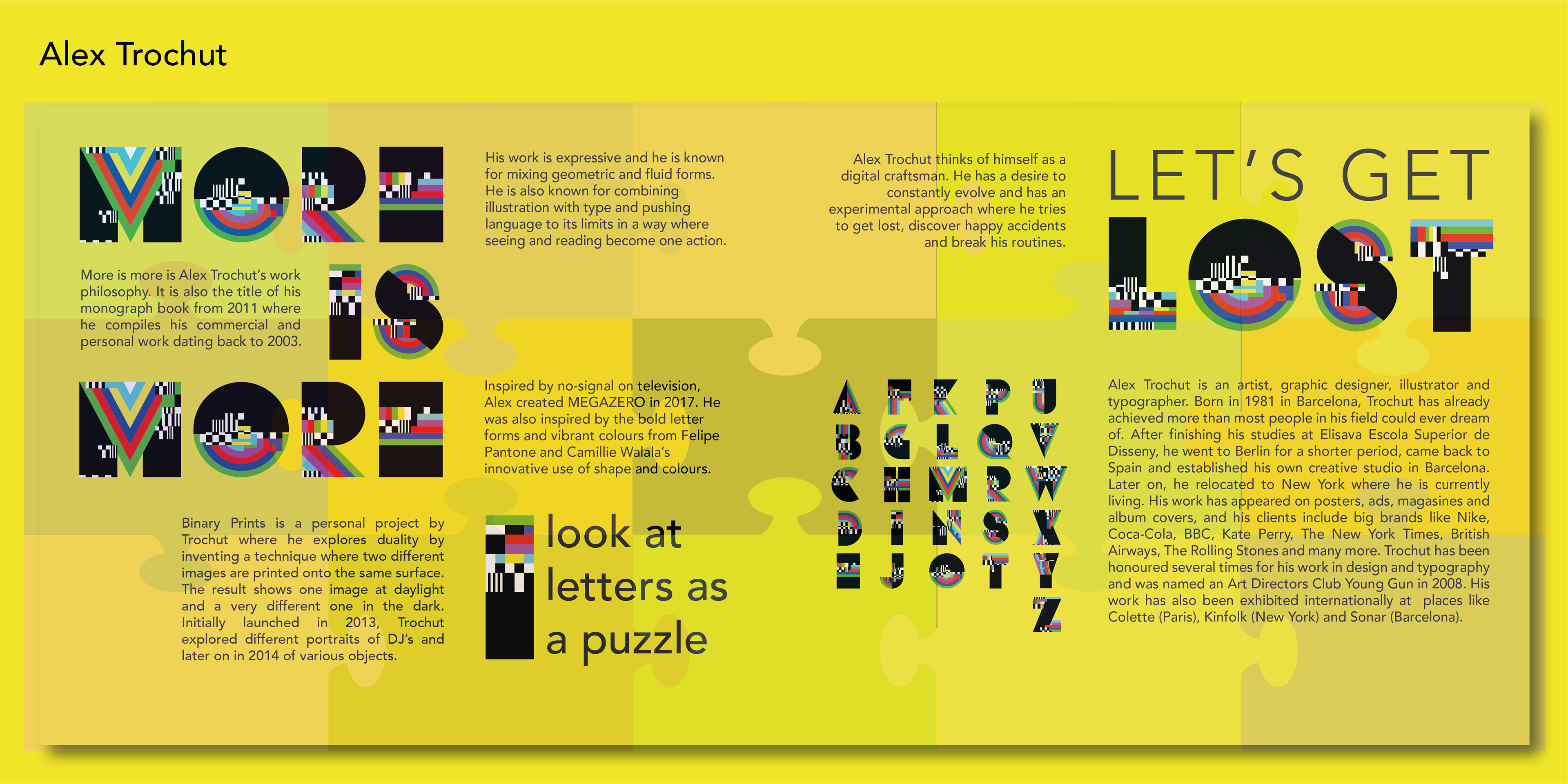
The outcome was a booklet presenting the Spanish graphic artist and typographer, Alex Trochut. The booklet centers around his work as a typographer and is inspired by Trochut's MEGAZERO font, his philosophies and manifestos.
The booklet includes 4 double spreads and was produced in Illustrator. Format: one page W200xH200mm, double spread W400xH200mm.
How
Despite his young age, Alex Trochut has achieved more than most people. His work is impressive, inspiring and offers lots of areas to explore. This is also the challenge, because how do you approach the work of a master, let alone integrate it in a booklet?
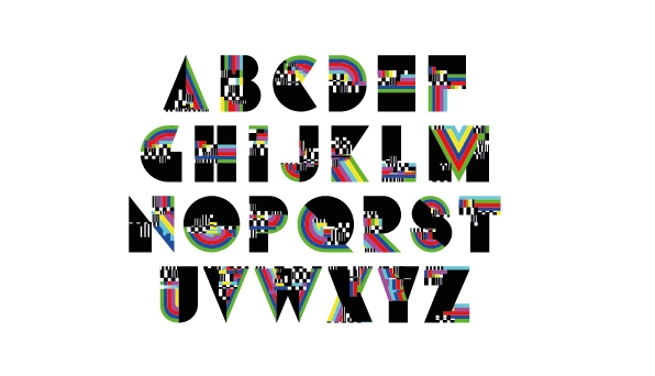
During my research of Trochut’s fonts, I learned about MEGAZERO. Like his other fonts, it is distinct with unique shapes and offers a colour palette which could help shape the colour universe of the booklet. I also collected quotes by Trochut, expressing his work philosophy or design process. It says something about him and how he works. I also became more aware of the fact that Trochut is minimalistic not only in character but also in terms of design, although it is still highly advanced and innovative.
Keeping all this in mind, I sensed how I could feature Alex Trochut without copying him.
Design process
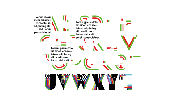
My initial idea was to fragment and show single elements of the MEGAZERO font, e.g. only green coloured elements. Then as one browses through the booklet additional layers are added and at the end of the booklet the complete MEGAZERO font is visible. This should be accompanied by information and quotes by Alex Trochut.
I think the idea is good, and it intrigues the reader to turn the page. However, I discarded this solution, because the design came across as too fragmented, confusing and not really a design that would enhance the overall look of the booklet.
I think the idea is good, and it intrigues the reader to turn the page. However, I discarded this solution, because the design came across as too fragmented, confusing and not really a design that would enhance the overall look of the booklet.
Booklet design process
Booklet design process
Booklet design process
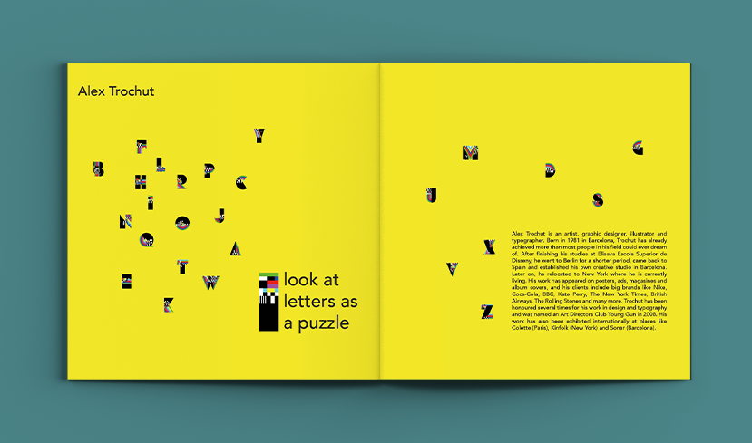
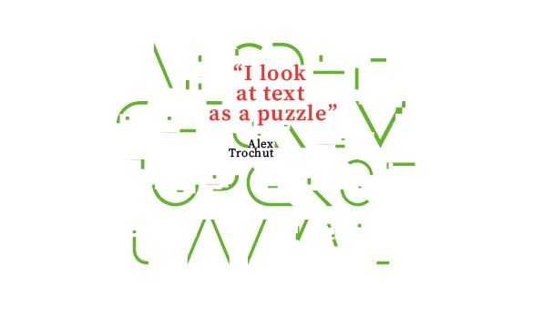
I also liked his quote "I look at letters as a puzzles". This inspired me to build the booklet up as a puzzle. For each spread, puzzle pieces would be added. At the end I discarded the idea, because I could not align it with a minimalistic look.
Final version
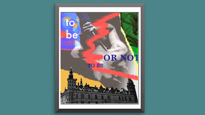
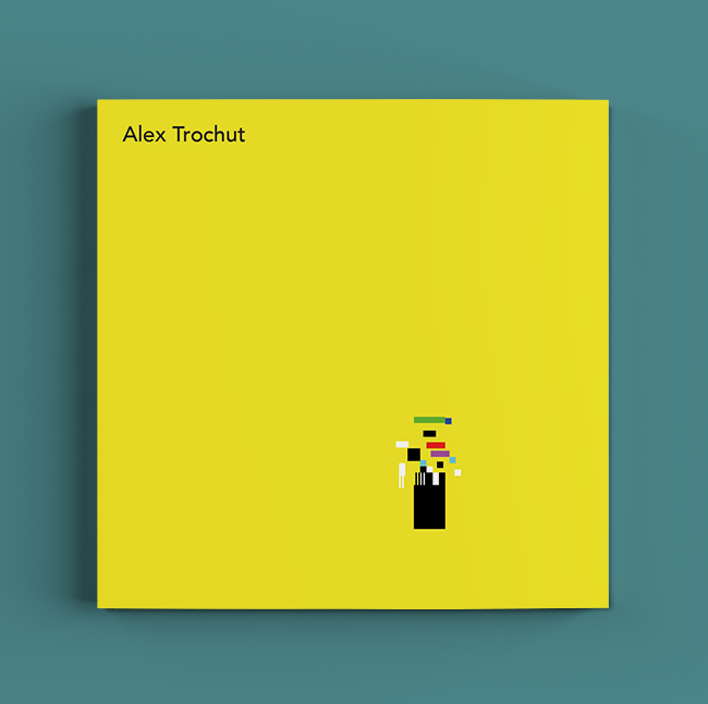
I kept some of the initial ideas, e.g. the letter I is dismantled on the front cover. There is a red thread throughout the booklet: On page 2 to 3, the elements in the letter I is in place and "look at letters are as a puzzle" is added to create a connection to why we see the I on the front cover. All the letters are spread out like you do with a puzzle. It is also here we get general information about Alex Trochut.
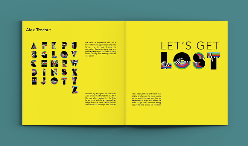
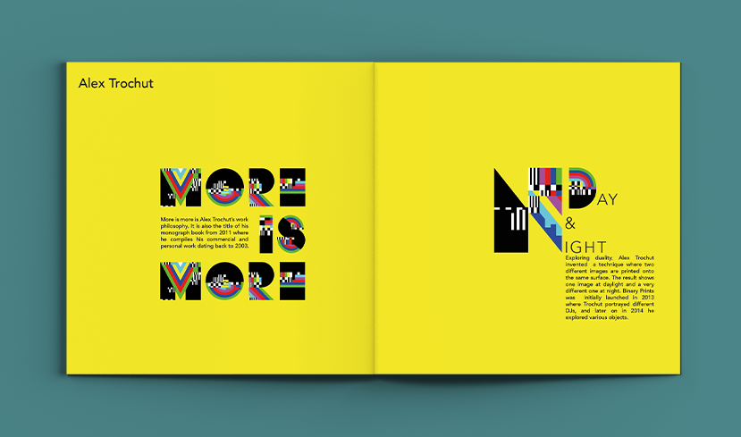
On page 4 ot 5, the alphabet is nicely ordered and the reader gets information about the font and A Trochut"s style as typographer and his work process. Page 6 to 7 explores his further work that is significant for Alex Trochut.
The quotes by Trochut ties the booklet together as well as the MEGAZERO font. In the final version I allowed more space around the text and elements. This aligns with the minimalistic style I also wanted to reflect in the booklet.