
Back cover Bossa Nova
Front cover Kpop
Back cover Kpop
About the project
The objective of this RMIT project was to explore genre codes and typography in music genres and designing two album covers. One cover should be in a layout that matches the original genre of the artist, the other cover should be in the style of an alternative genre. Additionally, I designed liner notes for one of the covers. The challenge was to deliver on and confuse expectations related to the genre codes.
I chose to work with Bossa Nova and Kpop as genres.
How
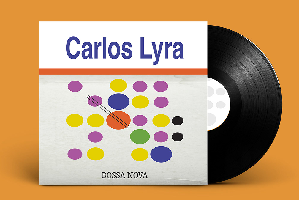
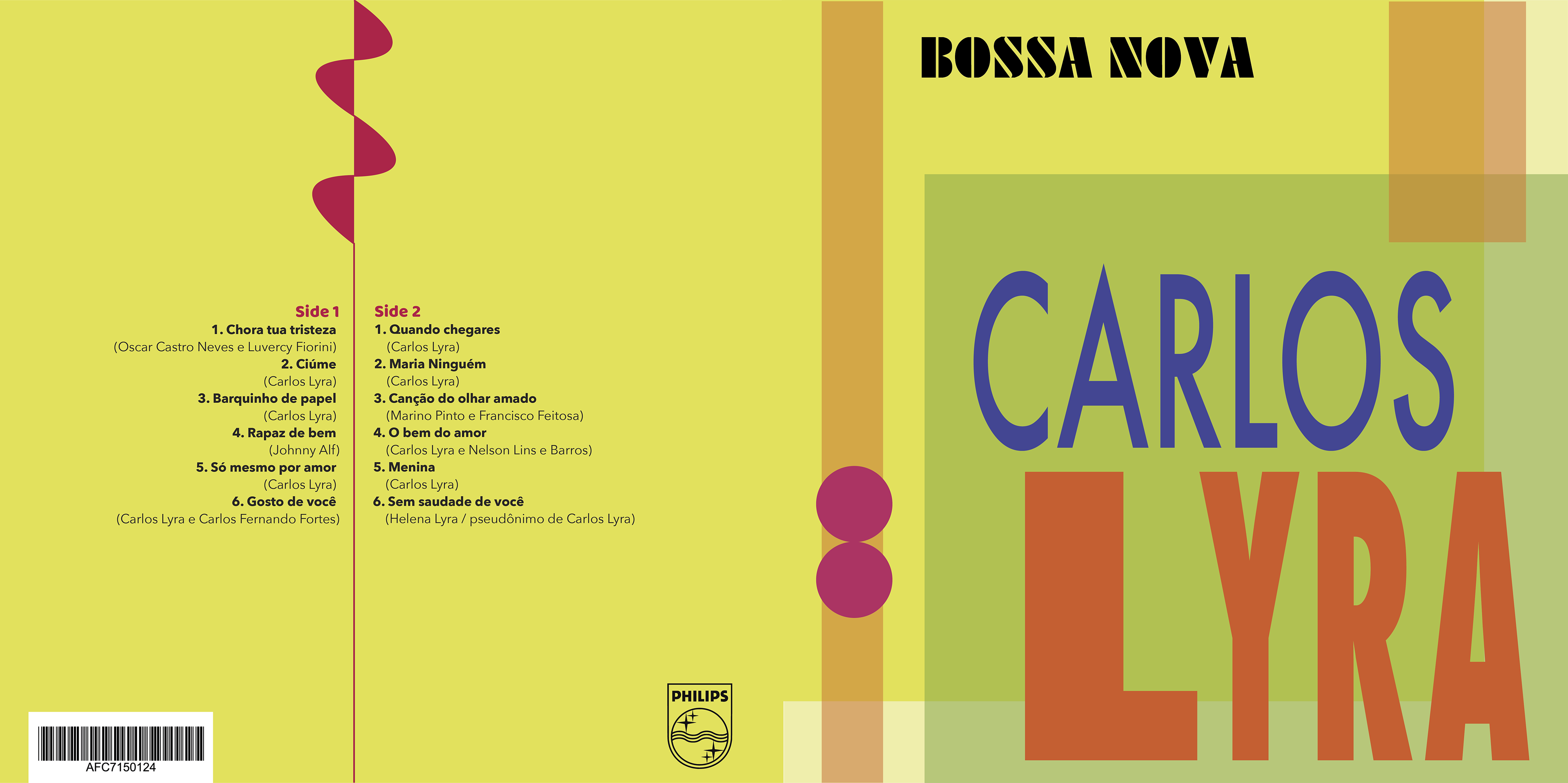
Bossa Nova
Based on my research, my initial idea was to incorporate elements that characterise the mid-century modernist era. I explored the potential of different shapes, (negative) space, clean lines and strong colours. I also aimed for a composition where the artist’s name and not the music genre is the center of attention.
The guitar is a typical instrument in bossa nova and also for Carlos Lyra as an artist. Therefore, I wanted to dispaly this instrument in the design. This is reflected in the two circles with thin lines representing the strings on a guitar. The sound is reflected in the curves at the end of the lines. To be aligned with the typefaces typical of the mid-century modernism, I chose geo sans serif fonts.
Work in progress

Work in progress
Work in progress
Solution
The guitar chords of bossa nova have a specific and unique pattern. I explored the idea of depicting the most frequent guitar chords on a grid and ended up with a dotted pattern as displayed above. The enlarged circles indicate how often a note is being repeated in different guitar chords. I liked the potential of this pattern. Firstly, it created a unique connection with bossa nova and the guitar which I could highlight by adding two straight parallel lines through two circles. Secondly, the circular form of a note aligns with the use of shapes in mid-century modernist design. Thirdly, I could display a range of colours characteristic for this time period. I could also explore space by scaling the pattern down and leaving some air around the pattern. I added an enlarged orange line that functions both as content divider and highlighter of the artist. I chose to place bossa nova on the same background as the pattern, because I think it belonged together with the guitar chords.
Typography
To be aligned with the typefaces of the mid-century modernist design, I used Helvetica bold for the artist’s name which I manipulated to appear a little more condensed than its orginal form. I used Egyptienne to display bossa nova which I also made a little more condensed.
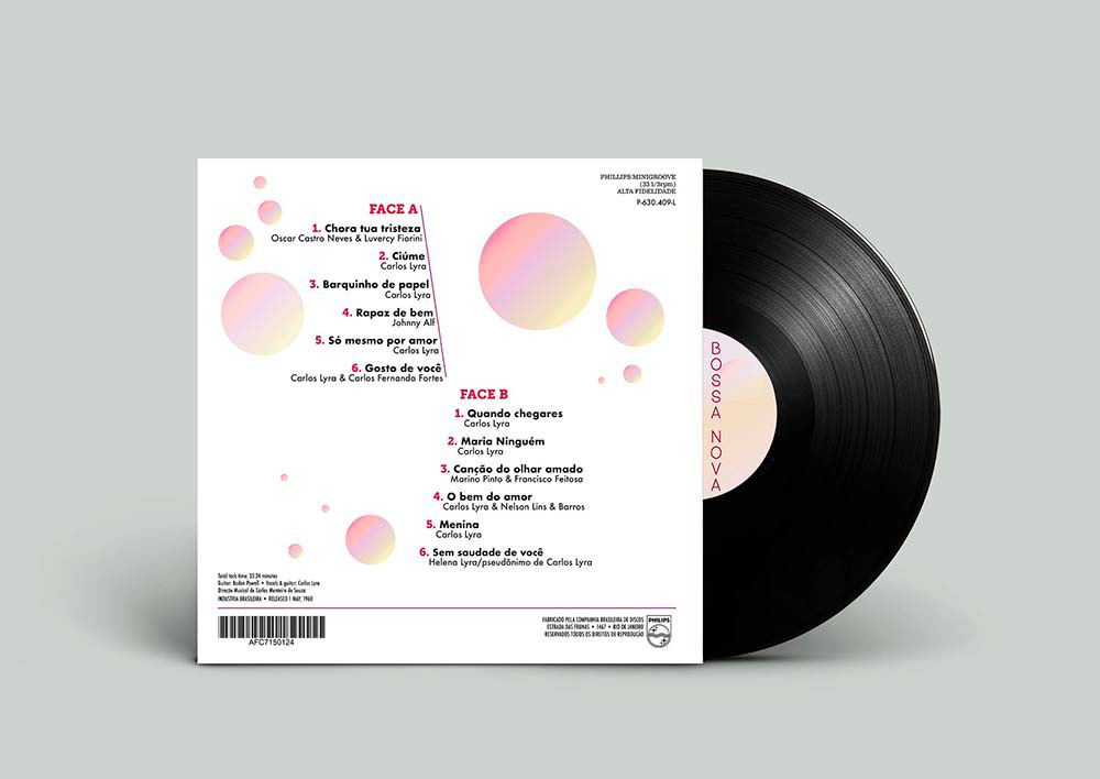
On the back cover, I created a hierarchy for the sound track by combining Helvetica in different sizes, weight and in italic with Optima bold. To make the song titles stand out, I used the same blue colour from the dots on the front cover. Production information is mostly in Helvetica combined with Optima and Egyptienne. I added some extra leading between each song and songwriter to make more clear what belongs together.
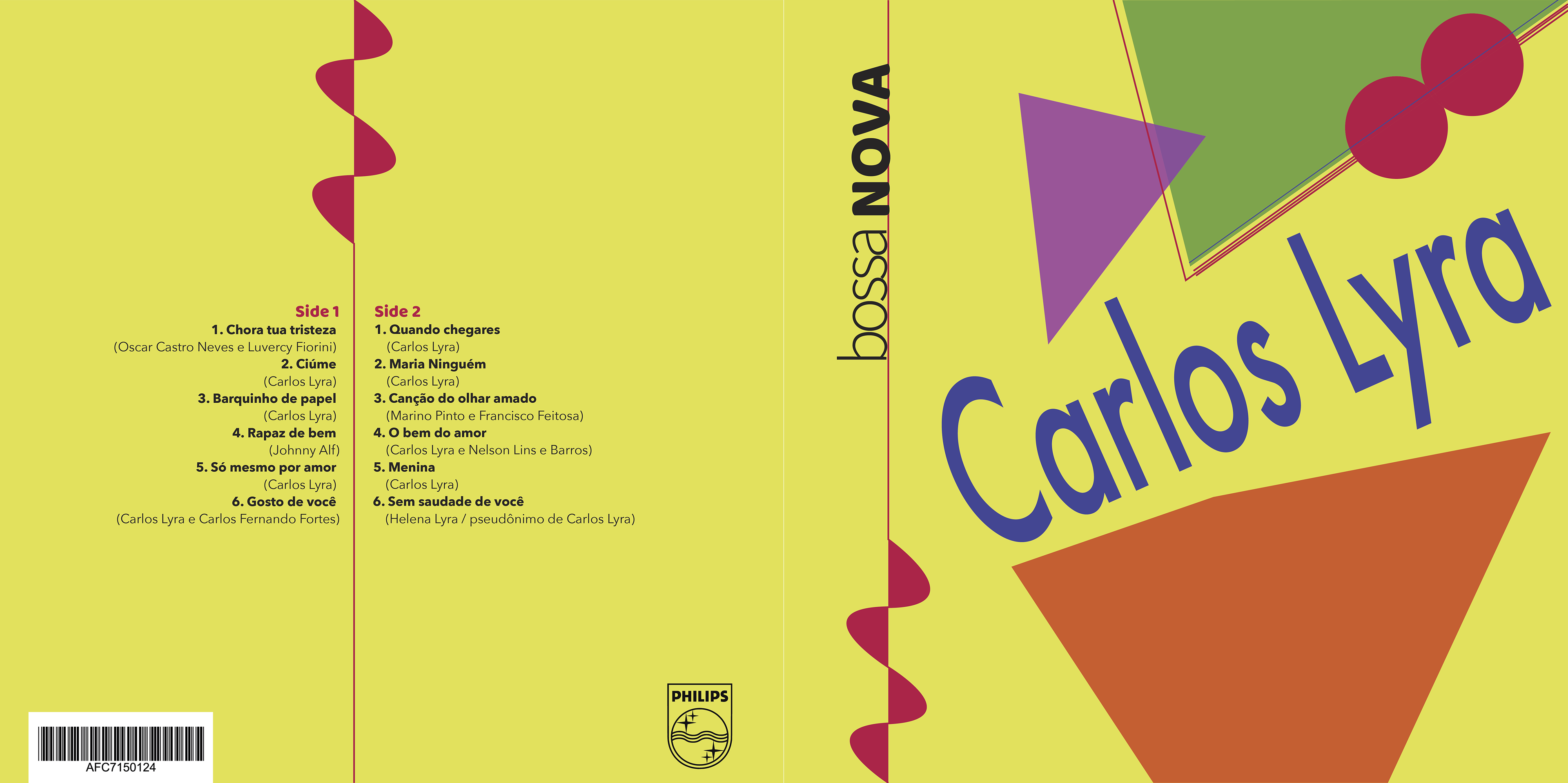
To create a design connection between front and back cover, I displayed the ‘guitar’ but in grey to enhance the vintage look. I used illustrator to design this album cover.
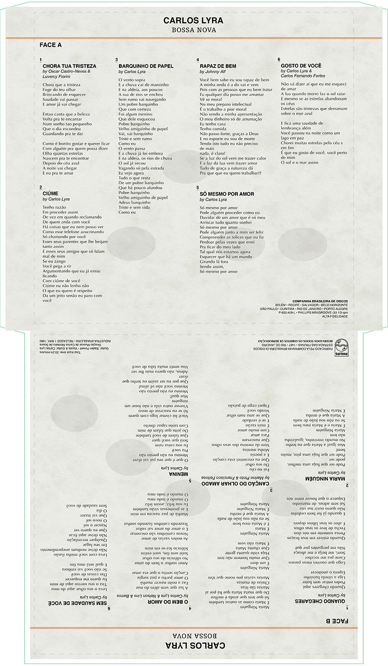
Liner notes Bossa Nova